14 DAY TRIAL //
 Cyber-attacks are more common than one would think, and several security companies with sufficient visibility across the globe have created truly amazing visual representations of the threats hitting their targets.
Although the graphics do not show all the attacks, there is enough data to get an idea of what country is responsible for most of the attacks and what its main targets are.
Threat maps are impressive, but also worrying
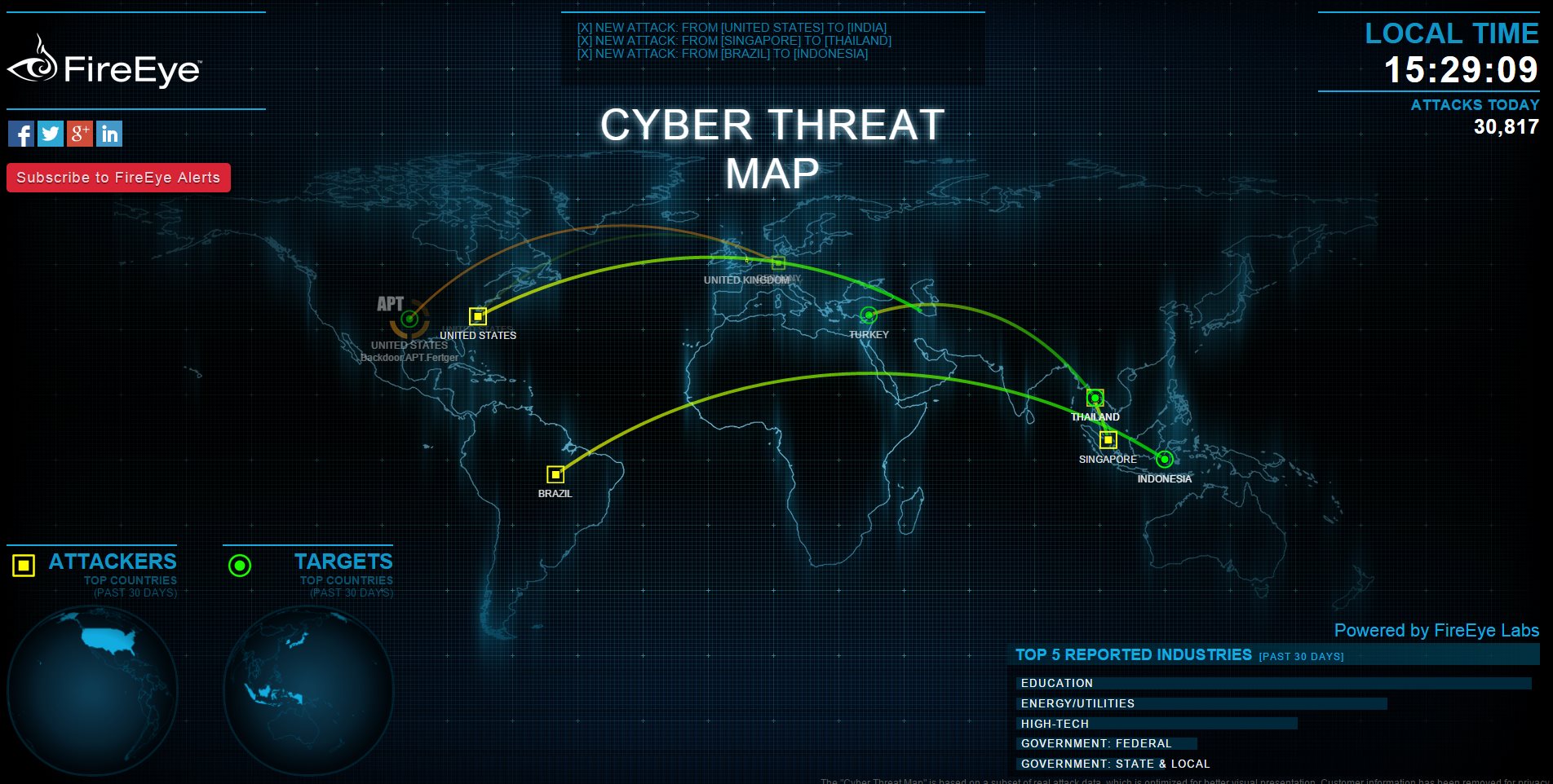
FireEye created its ThreatMap in order to be able to keep a better eye on the behavior of a malicious actor. It relies on real information collected in the past 30 days and represents malware communication between an infected machine and the command and control servers.
Apart from the origin and the destination of the communication, there is little information provided, but it offers a glimpse at the exchange of traffic from advanced persistent threats and where they are located.
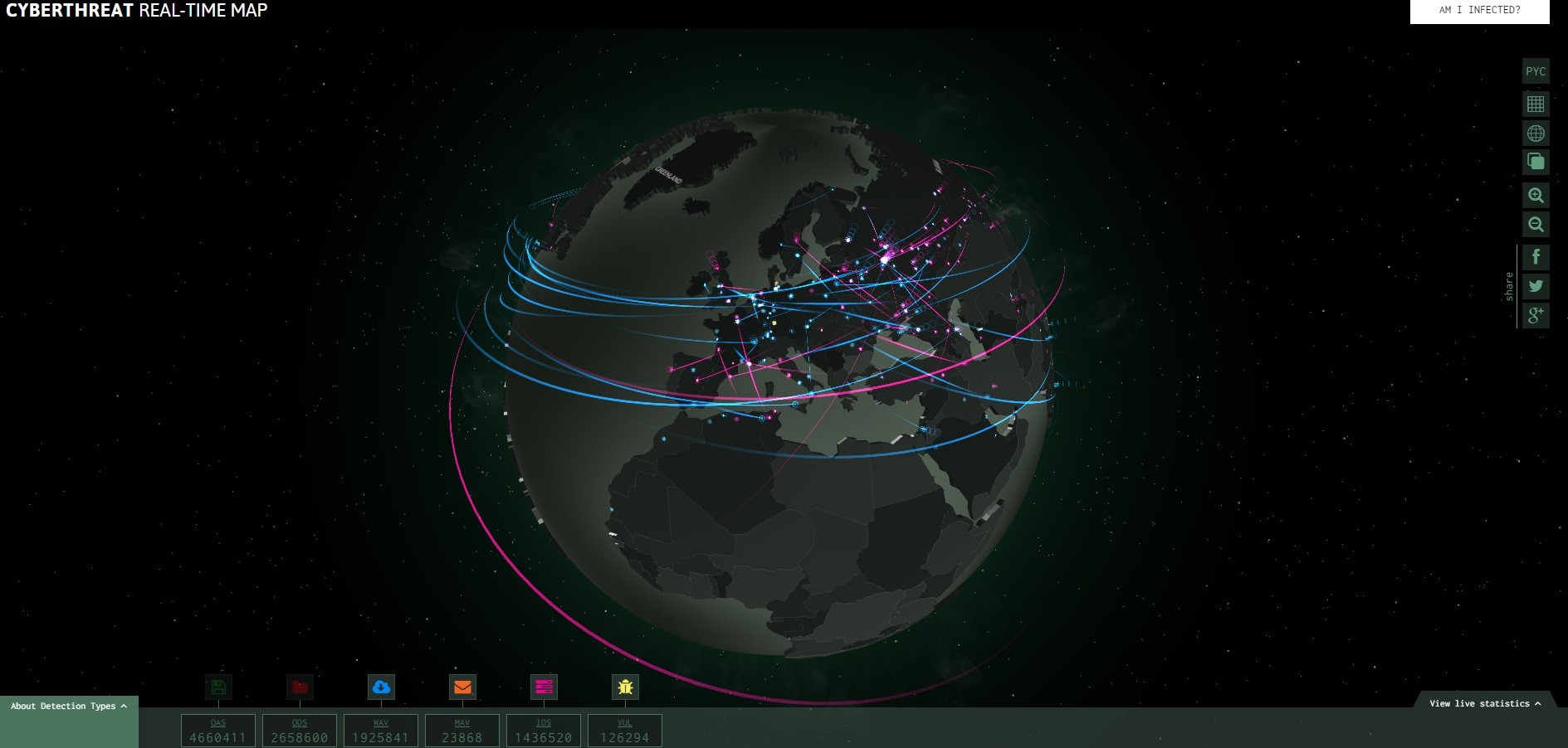
Kaspersky has also created a page with the visual representation of the threats. The data is pulled from antivirus scans, email and web antivirus detections. It also includes objects identified by vulnerability and intrusion detection sub-systems; obviously, all the information is collected anonymously, with the consent of the user.
Called CyberThreat Map, their draft came up with an interactive approach. The data available includes the ranking of the selected country as far as infections go and a break-down of the detection types.
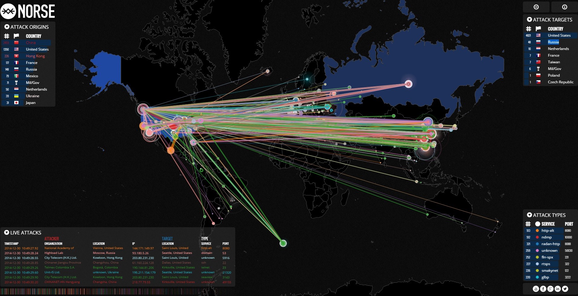
Another threat map is available from Norse security company, which collects live attack intelligence. Its take on the threatscape is probably the richest in information, as it shows a list with the top targets and top attackers, as well as the most common services and ports hit.
Moreover, it includes the IP of the attacker and the organization it belongs to. We managed to capture some overwhelming pictures (check the image gallery below) with the US being under serious salvos originating mostly from China, but also from other parts of the world.
According to Norse, the map displays only one percent of the total traffic flowing through its platform; but even so, the current state of cyber warfare is impressive.
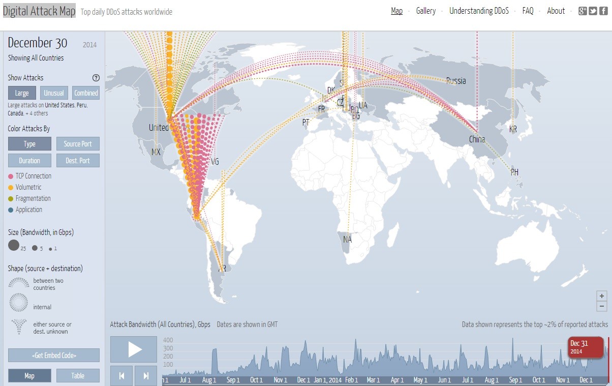
Distribute denial-of-service is also displayed graphically
For a look at the distributed denial-of-service (DDoS) attacks, Arbor Networks makes available the Digital Attack Map, a project built in collaboration with Google Ideas. It displays anonymous traffic data that can be used for checking historic trends or for finding info on outages that occurred on a certain day.
One should not expect real time information, as it has to be processed before it is translated into a graphical experience. However, there is sufficient information to determine a certain behavior originating from a specific country and directed towards another.